This post is by Karl Barksdale, Customer Concierge at Delighted
If a survey doesn’t instantly communicate its purpose, isn’t from a trusted source, or seems trivial, it will be ignored. This is the conventional wisdom. But here’s another obvious point:
- Many respondents simply skim-read surveys.
Furthermore, there are indications that skim-reading is becoming more prevalent. If time-starved respondents are increasingly pushing through surveys at a clip, should we craft our surveys to be skim-reader friendly?
We think yes! A skimmable survey is a survey that is easy to understand and answer, inviting more accurate and honest feedback.
Let’s take a look at how customizing a survey for skim-readers can play out.
The 5 keys to skimmability
Skimmability suggests that respondents should see at a glance:
- A clear, unambiguous question
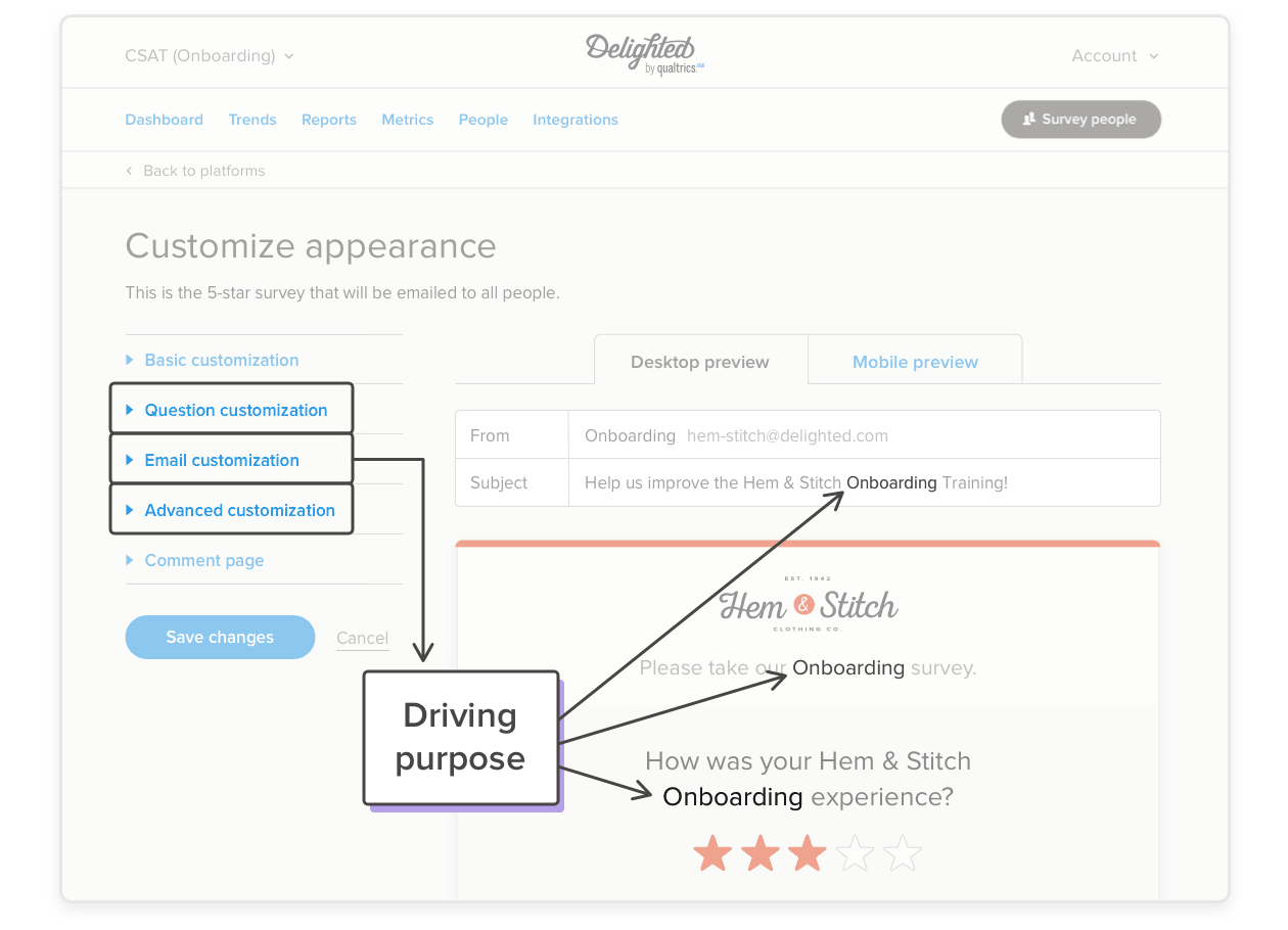
- A driving purpose
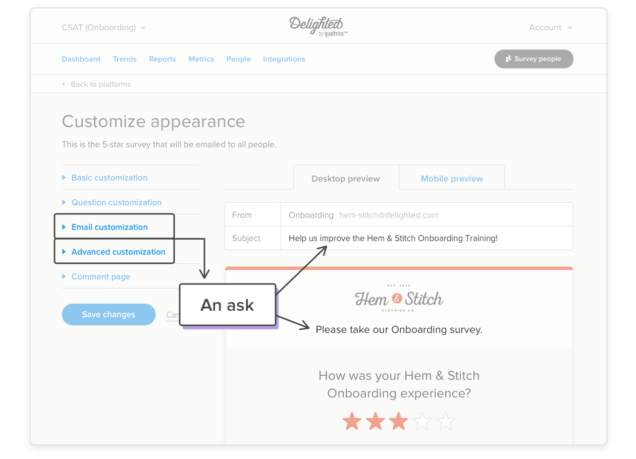
- An ask
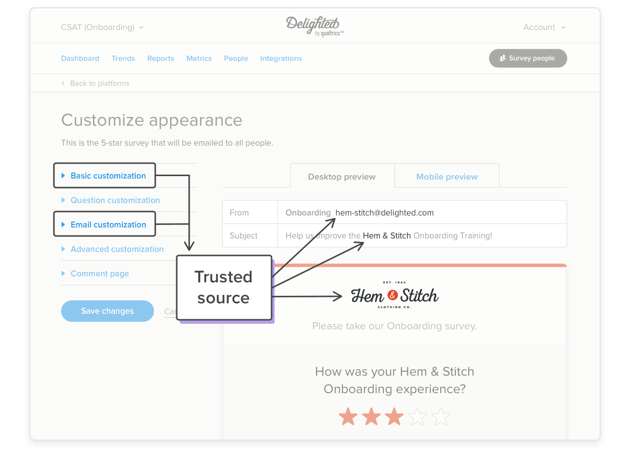
- A trusted source (e.g. Your brand)
- A simple way to respond
Can all of this be captured by someone who is skimming? Absolutely – by carefully applying the customizations seen here.
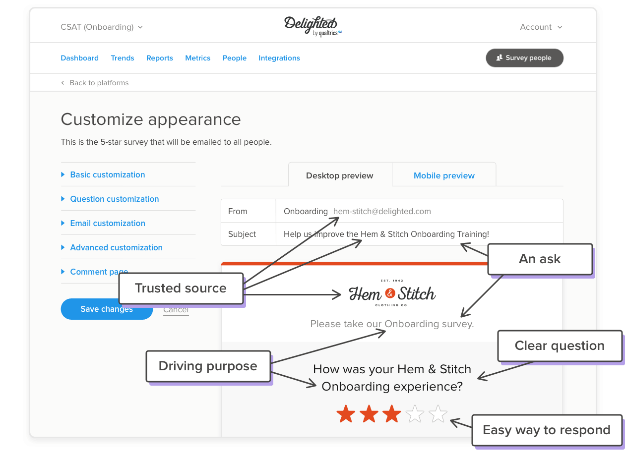
This eye-popping clarity is what makes Delighted surveys so effective. This precision can be achieved by using the tools found in the Customize Appearance sidebar. (Review how to make these changes in Core Certification Module 3 found in the Certification section of the Help Center.)
1. A clear, unambiguous question
Taking a survey shouldn’t be tedious! Questions that are unclear, riddled with spelling errors, or are too long and complicated will negatively impact response rates. Consider these solutions for your survey skimmers:
- Avoid long, laborious questions
- Use clear and simple language
- Avoid terms the skimmers may not understand, like “survey speak”
- Don’t use uncommon acronyms
- Avoid multiple clauses, as seen here, often linked by commas; or worse – semicolons!
- Place the important “ask” near the beginning (e.g. “How satisfied are you,” or “How do you rank.”)
- Don’t sound spammy!
- Avoid “push polling” or leading questions
Delighted starts by giving you a default question, which is usually near the mark – but you can often do better! The problem is, it’s easy to make questions worse by overcomplicating things. To see what we mean, here are some good and bad examples. Note the obvious mistakes in the first two:
- Very Bad: “After spending two hours with the Hem & Stitch onboarding team, on a scale of 1-5, how effective do you think the overall onboarding training actually was?
- Bad: “How great was the 2-hour B2B H&S onboarding training from last week?”
- Good: “How satisfied were you with the Hem & Stitch Onboarding experience?”
- Good: “How was your Hem & Stitch Onboarding experience?”
| Use Capital Letters on Critical Attention Getting Words! Go ahead. Break a few Capitalization Rules. Why? Ever noticed in Google Adwords that some advertisers use Title Case (initial capital letters) and some don’t? Try a few random searches and decide which approach attracts the most attention. Advertisers that use initial caps effectively will likely Collect More Clicks. Albeit, Overdoing Capitalization Will Make Reading A Bit More Tedious. Ergo, we’ve been selective in our Hem & Stitch example in this article by only capping the word “Onboarding.” This will draw attention to the main purpose of the question so that even skimmers can’t miss it! This choice drives our internal copy-editors to distraction for its grammatical impropriety – but they don’t have to worry about click-throughs, return rates, validity, reliability, and skimmers. You do! |
2. A driving purpose
People respond at higher rates if it is abundantly clear what the survey is about. Respondents hate to be fooled and are often offended by push-poll surveys, which are specifically designed to lead someone toward a predefined answer. Push-poll questions tend to make for wordy, convoluted questions as well. (This technique is often used in political surveys.)
To avoid this trap, be transparent. Make the driving purpose of your survey extremely clear. If it is a survey regarding onboarding, state that. If possible, try to stay within that theme, even throughout your Additional Questions section.
In our example, we used Question, Email, and Advanced customization options to clearly signal what the survey is about – Onboarding! And yes, we capitalized the O to give it more emphasis for our skimmers to see at a glance.
3. An ask
Be transparent about your ask in the subject line of an email survey. It’s okay to ask people for help. It’s okay to ask for an opinion. When someone is asked in a transparent way, they are likely to say, “Yes.”
Also, use the Advanced customization to add an intro message, which can be turned into an ask as well. Avoid impeding the readability of your survey by overcomplicating the intro message. Also, don’t use this valuable space with a throw-away comment that isn’t germane to the survey.
You can use up to 300 characters in your intro, but please don’t. Your respondents will thank you. Here are a few examples:
- Very Bad: “You have completed our Onboarding training. We now need your input to make our training better. Please reply to this survey by Thursday at the latest.”
- Bad: “Hello from your friends @ Hem & Stitch! We will keep you in stitches!” (Okay, maybe this is not a terribly bad example.)
- Good: “Please take our Onboarding survey.”
- Good: “Thank you for taking our Onboarding survey.”
Hem & Stitch simply asked, “Please take our Onboarding survey” in this intro message:
And while we risk running afoul of our copy editor again, a period at the end of an intro message is optional. It’s a stylistic choice, and therefore, it is your choice. (In our example, we left the period based on habit – but we can always delete it later if we change our minds.)
4. A trusted source
People are more likely to respond to a survey from a trusted source. Therefore:
- Place your logo front and center
- Have your survey come from one of your corporate email accounts
- Use your name – or the name of your business – somewhere in the question or in the supportive text
Build trust over time by being transparent with your results, too. It’s okay to send feedback to those providing you feedback about the feedback you’ve received. (Whew.)
Following up is always a good idea as it can build trust for your next survey. So turn on Autopilot and share the recurring results. You’ll get better response rates down the line if your audience knows that their input is making a difference.
5. An easy way to respond
Delighted makes it easy to respond with a consistent four-step survey flow. These surveys are a skimmers’ delight. It is very hard for respondents to make a mistake and select the wrong score.
With most surveys, the lowest scores are on the left with higher scores to the right. Some methodologies suggest that randomly switching directionality will encourage the survey taker to read more carefully and avoid skimming. However, that tactic can also create false positives from those in a rush, so Delighted chooses to keep things consistent.
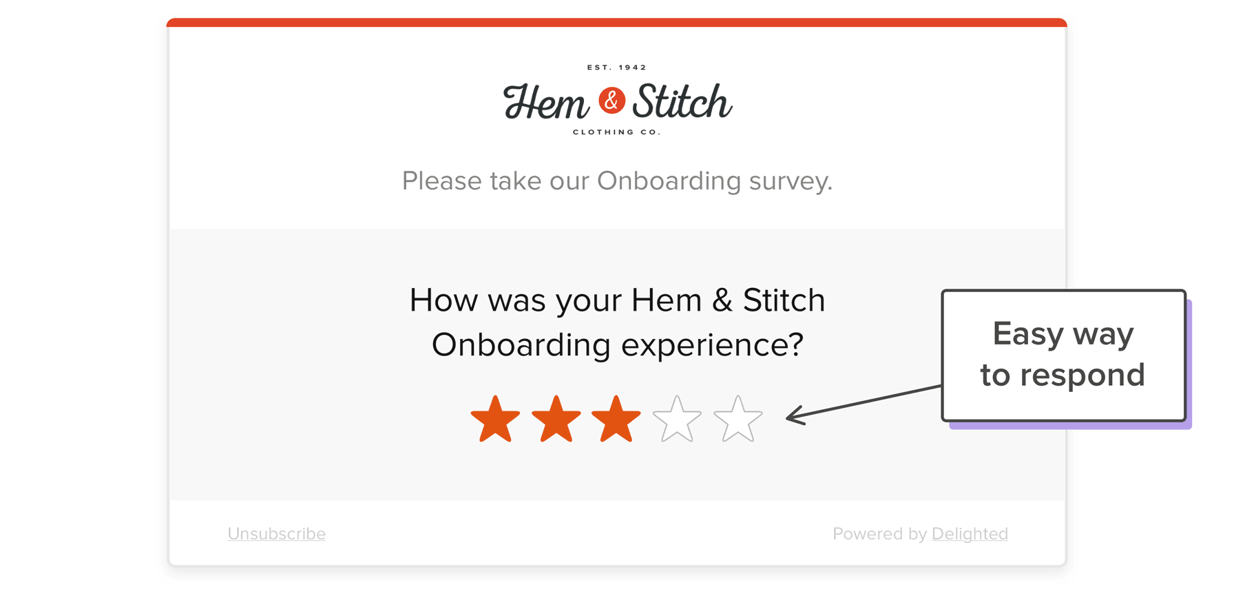
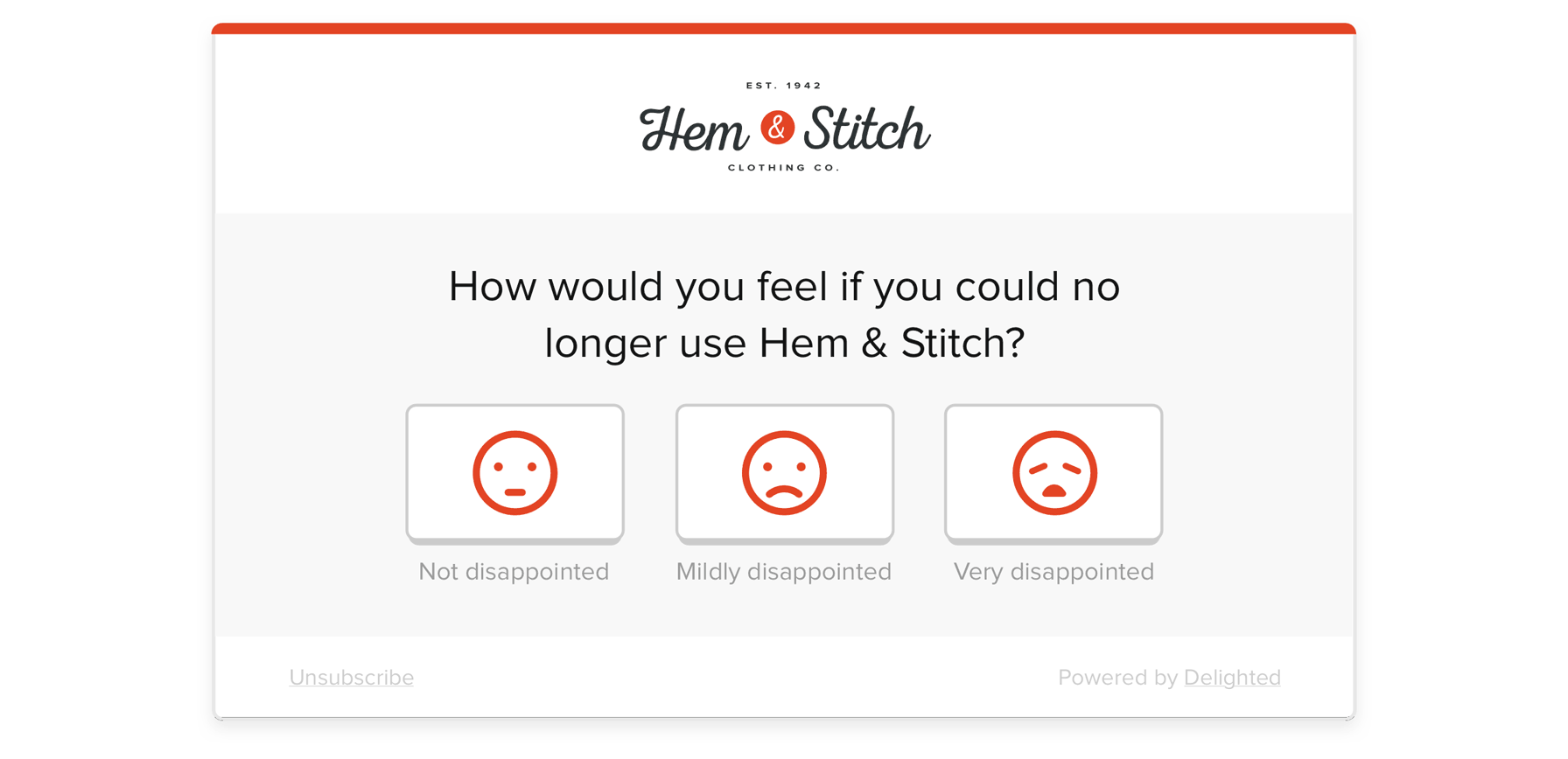
Delighted’s clean design helps your respondents select their preferred scores with little or no friction. For example, the emoji-like faces in the Product/Market Fit survey type make this 3-point scale so easy to follow that even your skimmers should be able to spot and select their preferred score at a glance.
Make your survey a skimmers’ delight
In the end, gathering a representative sample of valid and reliable results is what really matters. Skillfully crafted surveys that communicate a purpose and build long-term trust will yield improved response rates overall. By carefully proofreading and applying the types of customizations explained here, you’ll be able to elicit meaningful feedback, even from the skimmers in your audience.
All this said, not every survey should be skimmable. Sometimes, other approaches (longer surveys, more complex questions) may be required to gather the information you need.
One last piece of advice: don’t overthink it. Confidently make your changes, remembering that you can assess your metrics regularly to see if your customizations are helping and readjust as needed.
About Karl Barksdale
Karl is a veteran of WordPerfect, Novel, Google, and Cengage (where he wrote 65 software-oriented textbooks for grades 4-14). His last 10 years have been at Qualtrics/Delighted where he is currently employee #26. Well past retirement for most, he counts Qualtrics/Delighted as his all-time favorite dream job – and that he would be bored to tears without it. He keeps fit training for triathlons and is an age-group member of USA Triathlon’s Olympic, Sprint, SuperSprint and Mixed Relay World Championship teams. He is married with five grandchildren.
